






Inside the OakMega Design Team: Building a Social CRM Identity Around “Relationships First, Purchases Second” with Color Psychology
The new “OakMega 3.0” visual identity officially launched on Monday, August 1! This year (2022) also marks OakMega’s third anniversary. We sat down with Amber & Samuel, the designers behind our new corporate identity, to talk about the jump from 2.0 to 3.0: how color psychology shaped the new logo and design elements, and how they built a Social CRM brand around “relationships first, purchases second.”
 Howard HuangMarketing Specialist

The new “OakMega 3.0” visual identity officially launched on Monday, August 1! This year (2022) also marks OakMega’s third anniversary. We sat down with Amber & Samuel, the designers behind our new corporate identity, to talk about the jump from 2.0 to 3.0: how color psychology shaped the new logo and design elements, and how they built a Social CRM brand around “relationships first, purchases second.”
What Is OakMega 3.0, and Why Does Corporate Identity Matter?
It’s the height of summer. In the air-conditioned room, the crew is busy setting up equipment and adjusting camera angles for the interview. Sitting in front of the camera, looking a little nervous, is Amber Lee, brand visual designer on the OakMega design team and lead on “OakMega 3.0,” our corporate identity (CI) project.
“Through this identity refresh, we wanted to bring in more of the values and ideas that define OakMega, so the companies and customers who encounter us can better understand what kind of company we are,” Amber says, opening with a quick summary of OakMega 3.0.

In business settings, when you meet someone for the first time, a one-liner introduction quickly tells them who you are and where you work. Visually, it works the same way as spotting a stranger’s outfit on the street. “How someone dresses usually says a lot about their personality,” Amber explains after a moment’s thought, reaching for an everyday example.
Professional, warm, and, true to a startup, energetic and creative: these are the adjectives the design team distilled from the company one-liner, and they became the starting point for OakMega 3.0.
“These adjectives helped us map specific colors, then create design elements and guidelines, and ultimately build an entirely new corporate identity.”
From Color Psychology to 45-Degree Lines and Hexagons
Color psychology plays a major role in the OakMega 3.0 refresh. Purple and orange-yellow are the main colors of the new identity. In color psychology, purple stands for creativity and imagination and carries a sense of premium quality, much like technology itself; orange stands for warmth and friendliness.
Amber walks us through how these two colors connect to OakMega: “We felt the combination of purple and orange matches OakMega’s mission perfectly: using software to help brands communicate effectively with their customers and share information warmly.”
Whether in images across the website or in draft designs for business cards and slide decks, you’ll keep spotting lines slanting up to the right at 45 degrees, along with hexagons. That’s a small, deliberate touch in the OakMega 3.0 design.
“Compared with ordinary horizontal or vertical lines, diagonal lines convey a sense of speed, representing the whole team moving toward the same goal. The hexagon combines efficiency and connection.” By linking point to point within the hexagon, we hope to express OakMega’s desire to build warm connections with people, and our belief in “relationships first, purchases second.”
Introducing the New OakMega Logo
With a project this big, we couldn’t help asking whether there were any challenges worth sharing. Amber paused, then said the hardest part was designing a logo that fit the new look. How to keep the existing elephant while shedding its overly cute image was the question she and the design team kept coming back to.
Unlike the previous version, which used solid color blocks to draw a literal elephant, the new logo uses strong lines to outline the elephant’s form. “We wanted the new logo to tie more closely to the other two design ideas: the design elements and the colors,” Amber adds.
Look closely and you’ll see the new logo is built on a hexagon. Depending on the angle, you might see a hexagonal elephant, while someone else sees an elephant made of a cube. It’s an optical illusion that hexagons create in flat graphics.
“We experimented again and again with different lines and line weights to move past the old image.”
Is OakMega 3.0 Finished?
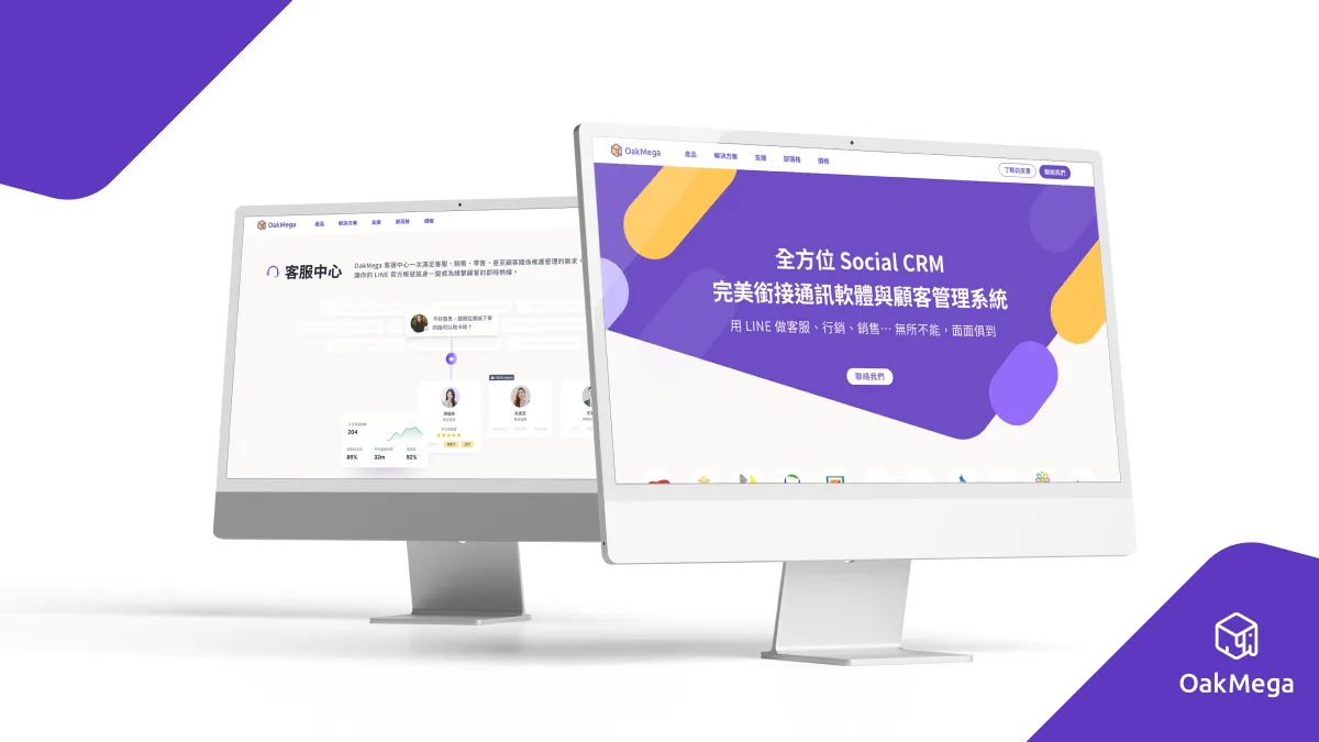
The OakMega 3.0 identity refresh officially launched on Monday, August 1, with the new look and logo rolled out across the OakMega website and all our social media platforms and channels. More updates are on the way, including supporting visuals and, most importantly, a refreshed product design, all coming before the end of this year (2022). Stay tuned, and visit the OakMega website to explore our new look and our “relationships first, purchases second” Social CRM services.